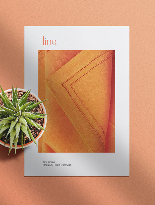
What do linen and luxury hotels have in common? Details.
Task
Simplicity is the key when you look at the work of Triad export's Settings by B. The identity needed that simplicity such that it fitted in the grandness of prestigious five star hotels, resorts and spas they serve worldwide. Orange being an optimistic and mood setting color, it brought freshness to the brand. The logo highlights the little details, the purity and the beautiful contrast which the brand believes in. We have tried to capture the texture, finesse and style of the in the business stationary and collaterals of the brand designed and produced with care.


More awesome stuffs


")