
At Kormoan, one of our biggest challenges is helping people understand that restraint does not mean compromise. Removing the obvious often feels uncomfortable, but it is what allows strong, lasting website designs and products to take shape.
Some websites feel effortless the moment you land on them. You are not searching for instructions or trying to work out your next step. Nothing competes for your attention. You understand where you are, what is being offered, and why it matters. That sense of ease is not accidental in great website design.
It has little to do with trends or visual styling. It comes from intention and from decisions made long before colours or layouts are designed. This is often where Apple’s website design enters the conversation, not as something to copy, but as an example of what clarity and simplicity looks like when it is taken seriously.
Why Apple’s Website Design Instantly Feels Right
When a website feels effortless, it’s rarely because of a single design choice. It’s because many small decisions are aligned. The message is clear. The structure is easy to follow. Nothing pulls you in competing directions.
What we have observed is that these experiences don’t rely on clever tricks or too much persuasion. They work because friction has been removed thoughtfully. You don’t have to interpret the interface or decode the language. The experience guides you quietly, without much effort.
It’s often misunderstood is that this ease in Apple’s website design isn’t a visual outcome. It’s a strategic one. It comes from knowing who the website is for, what that person needs to understand first, and what can wait. That’s where project discovery parts come in.
In our experience what makes a website feel right is not what’s present, but what’s been intentionally left out. Unnecessary sections. Competing messages. Decorative elements that don’t really belong. When these are removed, clarity has space to grow.
This becomes the foundation everything else is built on. Before layout systems, interactions, or technology choices, there’s a decision to design with restraint and focus. We know that restraint is very hard to achieve.
The Apple Effect on Website Design
Apple is often described as the benchmark for digital design, but what people respond to isn’t a specific aesthetic. It’s discipline. The confidence to be selective and the willingness to say less.
Apple’s website feels the way it does because it reflects how the company thinks. Priorities are clear. Opinions are strong. Messages aren’t diluted instead inspiring. The site doesn’t attempt to explain everything at once. It reveals what matters, exactly when it matters.
Trying to design “like Apple” by copying layouts or visual cues misses the point. The real lesson is mindset. This usually shows up when we have clarity before cleverness and understanding before noise.
Clarity Before Creativity
We have seen it many times and most websites struggle for a simple reason. They try to say too much, too early.
Before any visual decision is made, Apple is clear about what the user needs to understand in that moment. One idea per screen. One message at a time. Creativity follows only after that intent is clear.
We do this with every project and even suggest this useful exercise for any team is to open their homepage and ask a straightforward question: what should someone understand in the first few seconds? If the answer isn’t obvious, no amount of animation or clever copy will solve the problem.
Clarity isn’t limiting. Confusion is.
Website Structure That Reduces Confusion
Apple’s website navigation feels calm because it’s selective. The menu isn’t a catalogue of everything the company offers. It’s a carefully organised map.
Fewer choices reduce hesitation. Clear groupings lower cognitive load. Shallow structures make it easier to find what matters without digging.
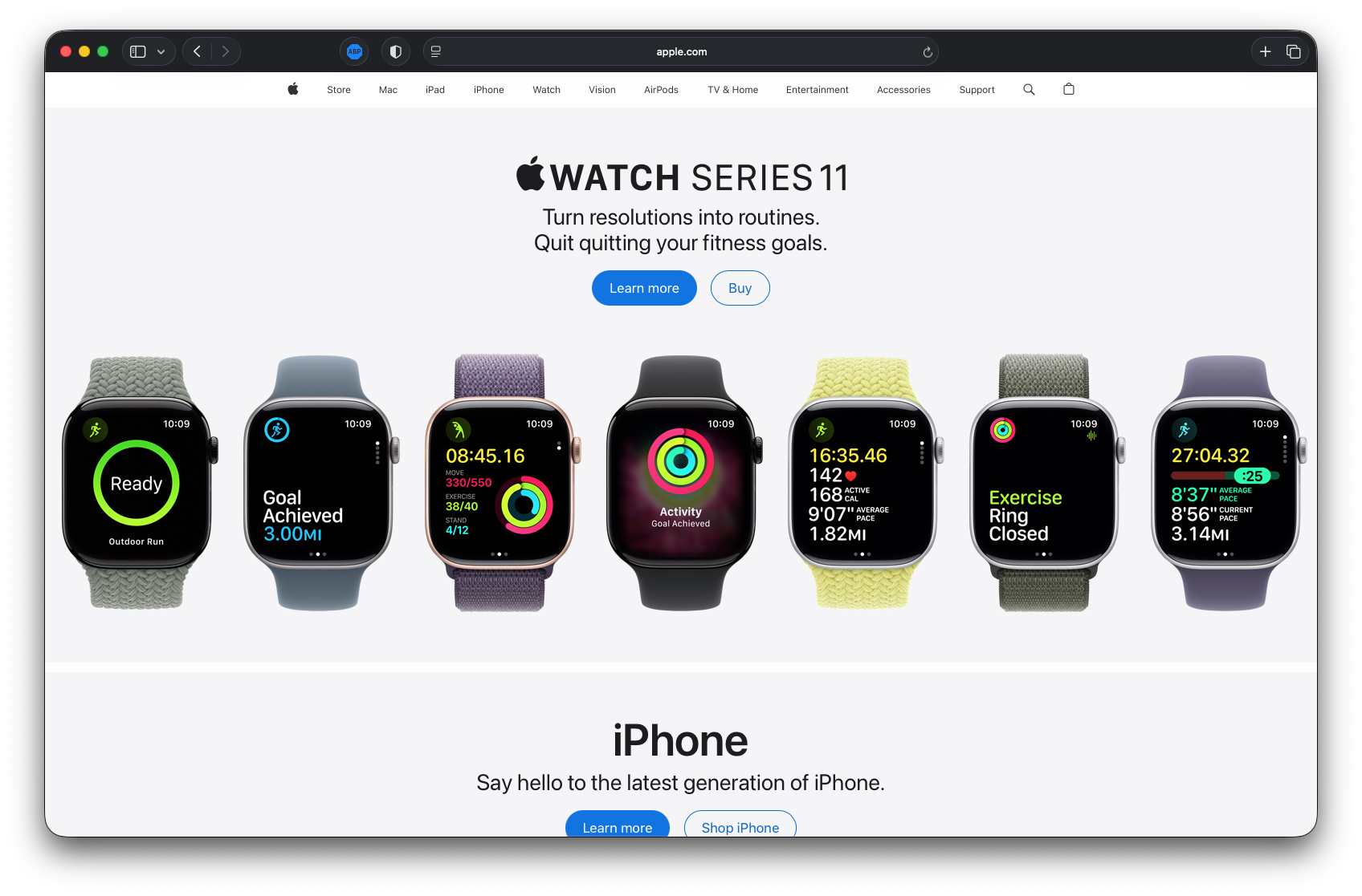
Image source apple.com
This isn’t about hiding content. It’s about organising it with intent. Good structure feels obvious after the fact. Poor structure makes users work to understand where they are and what to do next.
If someone has to stop and think about where to click, the structure hasn’t done its job.
Why Apple Treats Every Product Page Like a Homepage
One of Apple’s most understated strengths is how it approaches product pages. They aren’t secondary navigations. They are complete entry points.
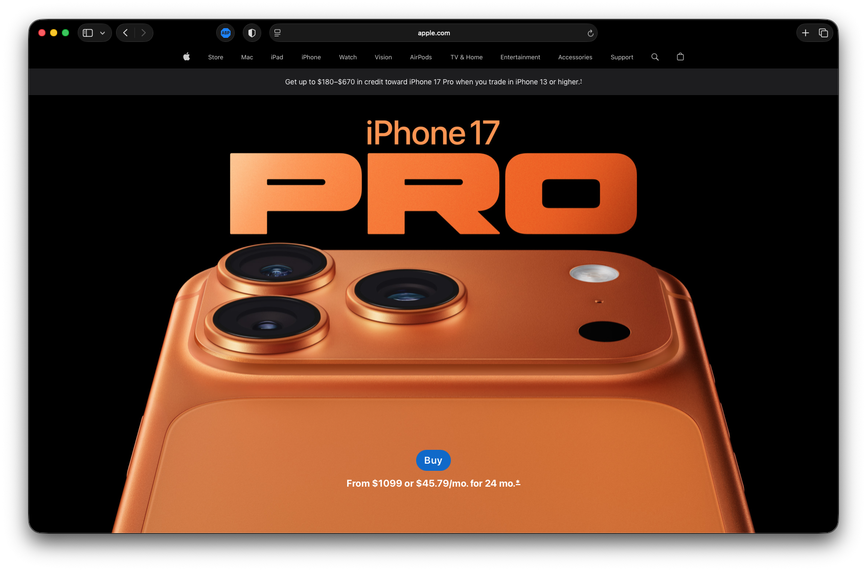
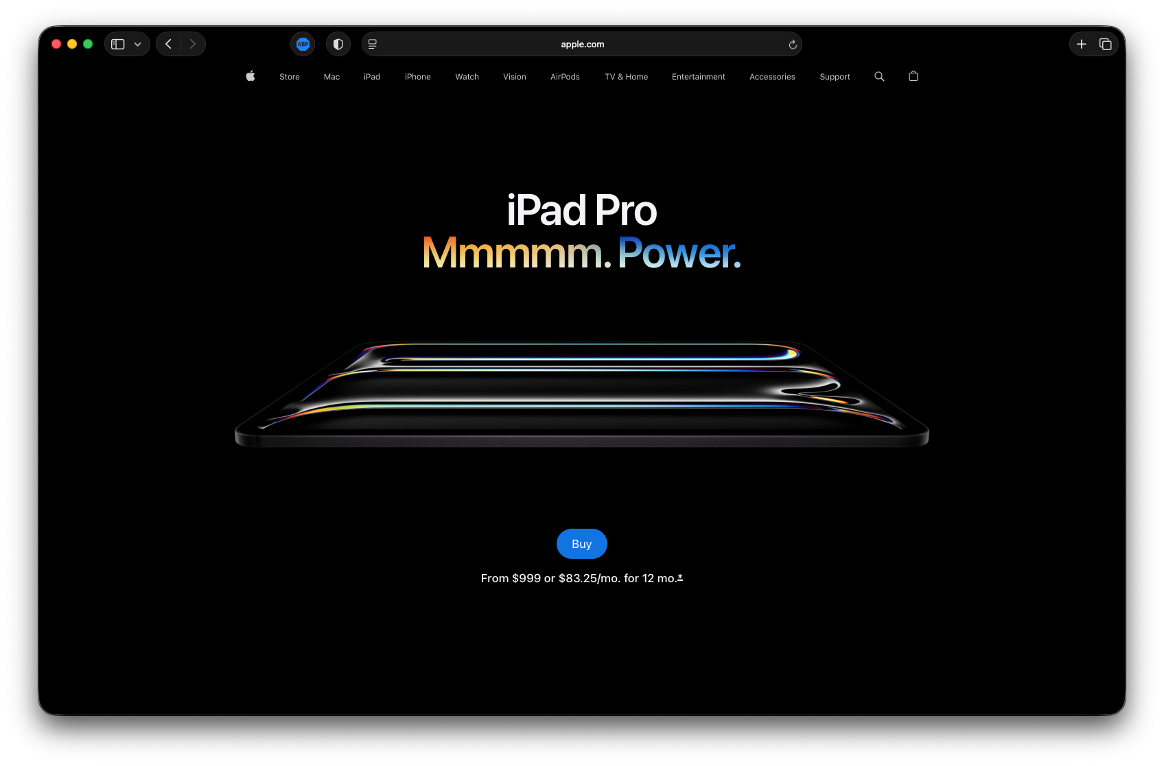
Image source apple.com
You can arrive directly on a MacBook or iPhone page from search or an ad and never feel disoriented. Each page introduces the product, builds context, answers questions, and moves the story forward. It doesn’t assume prior knowledge. It creates it.
For many businesses we have worked wih, this requires a shift in thinking. Instead of funnelling everyone through a single homepage, important pages are designed as full experiences. The assumption is simple: visitors may never see anything else.
When each key page can stand on its own, the entire website becomes more resilient and more effective.
How Content and Imagery Work Together
On Apple’s website, words and visuals are inseparable. Images don’t decorate the message, they carry it. Copy doesn’t explain the image, it completes it.
This only works when content and design evolve together. When content writing is treated as an afterthought, it shows. The experience feels assembled rather than composed. We have decoded Apple content strategy in another article.
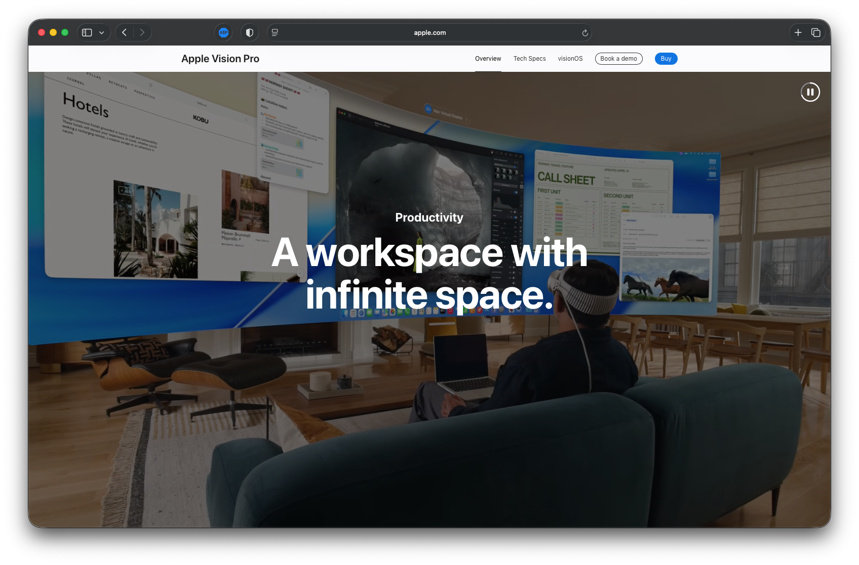
Image source apple.com
For teams building modern websites, this is a critical lesson. Content strategy isn’t about filling space. It’s about understanding the story being told, cohesively. The right image can replace a paragraph. The right sentence can anchor a visual.
That’s why at Kormoan designers and writers sit in the same cubical.
UI, Micro-Interactions, and Visual Restraint
Apple’s interface design rarely draws attention to itself, and that is deliberate. Animations and transitions are subtle. Movement exists mostly to support understanding, not to entertain or impress.
CTAs are simple, bold and without exaggeration. Hover states confirm action without distraction. Most of the time, you do not notice what is happening in the interface, and that is exactly the point. The experience works quietly in the background, allowing the product itself to take centre stage.

Video source apple.com
This way of designing requires a different kind of discipline. It means thinking beyond screens and components and considering how people move through an experience over time. Arushi, our Chief of Design, explores this in depth through a long-form conversation on how design should be approached, not as a visual exercise, but as a process of intent, restraint, and decision-making. Her perspective reinforces a simple truth: good design often disappears, but its impact stays.
That kind of restraint takes confidence. It is always easier to add more. The reward, however, is an experience that feels stable and trustworthy, things people tend to associate with premium products even if they cannot fully explain why.
Technology Behind Apple’s Website Design
What appears simple on Apple’s website is backed by a carefully chosen technical foundation. From what we have observed, the frontend relies on core web technologies like HTML5, CSS, and JavaScript, combined with modern frameworks such as React, Vue.js, and in some cases lighter tools like Svelte. These are used for consistency and performance, not novelty. Components are reused, layouts stay predictable, and animations rely on native browser capabilities rather than heavy libraries. Performance optimisation, from asset compression to lazy loading and tight control over third-party scripts, is treated as a core requirement.
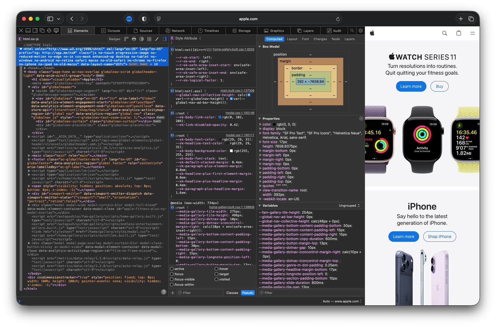
Image source apple.com
Behind the scenes, Apple runs on a custom, scalable infrastructure rather than an off-the-shelf CMS. The backend is largely Java-based, supported by a global delivery layer through Akamai. Networking optimisations such as HTTP/2, Brotli and Gzip compression, SSL, and IPv6 help ensure fast and reliable performance across regions. Speed and stability are part of the experience, not a technical afterthought.
The more important takeaway, however, is not the stack itself. Similar outcomes can be achieved with many modern setups. A well-architected React or Vue frontend, a thoughtfully built WordPress, Laravel, or Node backend, or even a server-rendered system with strong caching can all support this level of clarity. What matters is discipline. When architecture, performance, and content structure are treated as part of the experience, technology supports the vision instead of competing with it.
Why Most Apple-inspired Websites Fall Short
Many websites borrow Apple’s visual language but miss its discipline. Colour is removed, but complexity remains. Layouts are simplified, but messaging stays vague. The result looks minimal yet feels hollow. Web navigations are simple but doesn’t guide user flow.
Apple’s website works because it sounds like Apple. It reflects a clear point of view and a deep understanding of its audience.
Your website doesn’t need to feel like Apple. It needs to feel like you, at your clearest and most confident. Inspiration can guide while imitation only limits.
There’s No Shortcut to Clarity
When you step back and look at Apple’s digital presence as a whole, there is no single trick that explains why it works. There are no shortcuts hidden behind the design. What stands out instead is consistency, in how decisions are made and repeated over time.
Clarity comes first. Structure supports understanding. Content and visuals reinforce each other rather than competing for attention. Technology stays in the background, doing its work quietly. Most importantly, the experience respects the user’s time. That respect shows up in small ways, across the site, again and again.
These ideas are not reserved for large companies or iconic brands. They apply to any team willing to slow down and make deliberate choices. Not to design something that looks like Apple, but to build something that feels right for the people it serves and the products it creates.
If there is one idea worth returning to when thinking about your own website, it is this. Meaningful digital experiences are rarely created by adding more. They come from deciding what truly matters, and having the discipline to stop there.
Apple’s website is built for who Apple is. Yours should be built for who you are. What does your brand stand for?
At Kormoan, we work with teams who care deeply about clarity, intention, and the long-term impact of the products they build. Our role is often to help simplify before we design.
If you are ready to apply these ideas to your website or product, let’s decode your brand together.


