
There is a misconception in our industry that has survived for decades. We often celebrate products because they look simple. A clean interface, generous white space, a handful of buttons, and suddenly we describe the experience as intuitive. We admire companies like Apple for their minimalism, Nike for their powerful storytelling, or Google for a homepage that has barely changed in years. The simplicity is visible, so we assume that simplicity is what they designed.
I have never believed that.
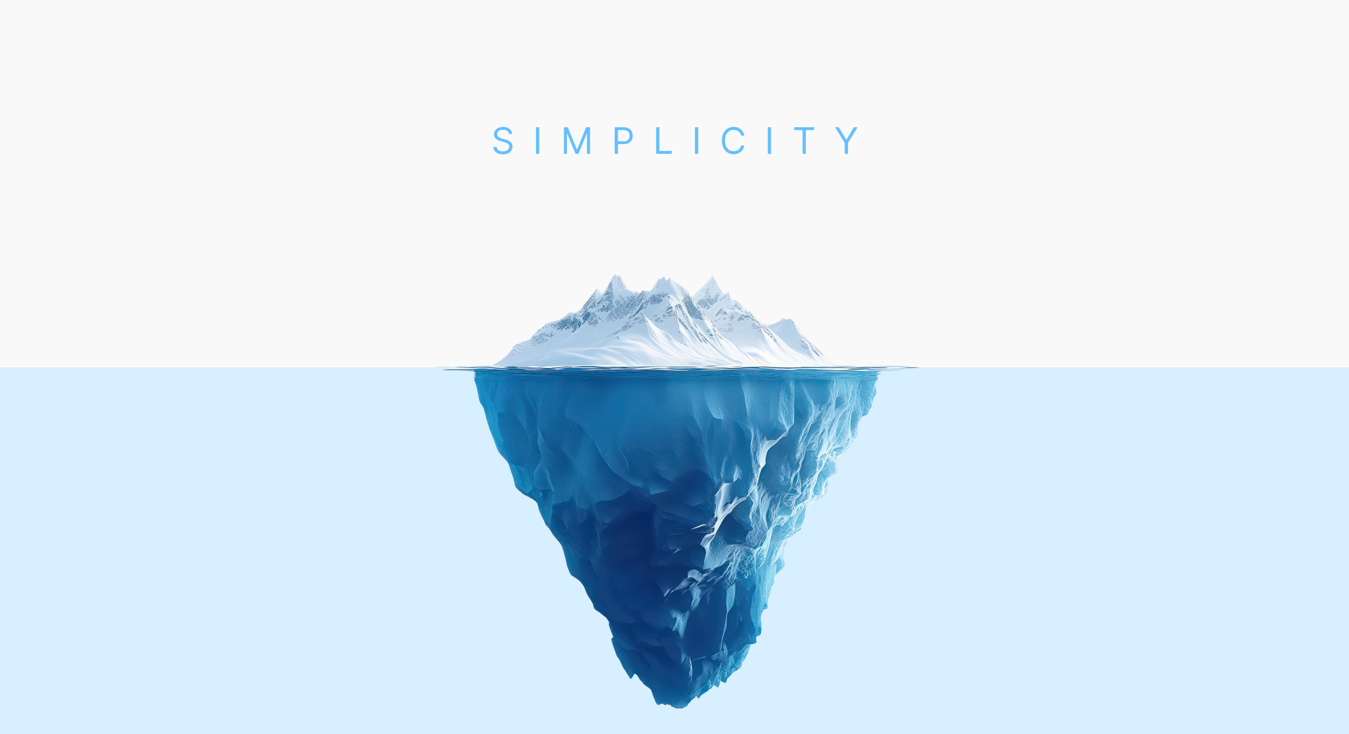
After working on digital products for more than sixteen years, I’ve come to realise that simplicity is rarely what we see. It is what has already been removed before we arrive. It is the countless decisions, debates, experiments, failures, and compromises that disappear behind an experience so that users never have to think about them. Simplicity is not the absence of complexity. It is what remains after complexity has been understood well enough to hide itself.
That difference matters because organisations everywhere are trying to simplify their products, yet many end up making them more confusing. They remove buttons but keep unnecessary workflows, redesign interfaces without questioning the underlying process or introduce artificial intelligence to automate decisions while asking users even more questions than before. Then interface becomes cleaner, but the experience becomes heavier.
The problem was never visual. The problem was always complexity.
We often mistake minimalism for simplicity
Companies aren’t able to achieve it, but minimalism has become one of the most influential design movements of our time, and for good reason. It encourages restraint, removes distractions, and helps create products that feel elegant. But minimalism and simplicity are not the same thing.
A dashboard can contain only five buttons and still leave people wondering where to begin. A banking application may look modern while forcing customers through seven unnecessary verification steps. An enterprise platform may use beautiful typography and consistent spacing, yet require weeks of training before employees become productive.
Visually, these products appear simple. Mentally, they are exhausting.
True simplicity has very little to do with how many elements exist on a screen. It has far more to do with how many decisions users are forced to make before achieving what they came to do. Every unnecessary choice consumes attention. Every unfamiliar workflow increases uncertainty. Every feature introduced without purpose creates another branch in the user’s mental model of the product. People don’t remember interfaces. They remember whether accomplishing something felt easy.
That is why the world’s best products are rarely defined by aesthetics alone. They are remembered because they reduce cognitive effort. They remove uncertainty. They quietly guide people from intention to outcome without demanding constant interpretation.
That is simplicity.
Great products don’t remove complexity. They absorb it.
One of the ideas I return to often is that complexity never disappears. It simply moves. Every product has complexity. Every organisation has operational constraints, technical limitations, business rules, compliance requirements, legacy systems, customer expectations, and evolving markets. None of those disappear because a designer creates a cleaner interface.
Someone still has to carry that weight. The real question is who.
The customer can carry it by learning complicated workflows, remembering obscure processes, navigating endless menus, and adapting to the software’s limitations.
Or the organisation can carry it by investing in better research, stronger product strategy, thoughtful engineering, and deliberate design.
The companies we admire consistently choose the second option. Apple doesn’t ask customers to understand the engineering decisions behind Face ID. Google doesn’t expect people to understand how billions of web pages are indexed before performing a search. Uber doesn’t ask passengers to think about routing algorithms, dynamic pricing, payment gateways, or driver allocation. Those systems are incredibly complex, but the products absorb that complexity instead of exposing it.
That work happens long before the interface exists. It happens during product strategy. It happens during architecture. It happens during research. It happens when teams spend months solving problems users should never have to think about. This is perhaps the most expensive investment any organisation can make. It is also the one users appreciate the most without ever noticing it.
Every new feature is another decision
Softwares/Apps/Websites have an interesting habit of becoming more complicated over time. The first version of a product usually solves one problem exceptionally well. Then customers ask for additional capabilities. Sales teams request custom workflows. Enterprise clients introduce new compliance requirements. Marketing wants more visibility. Operations need better reporting. Engineers build tools that improve flexibility. Eventually every department contributes something valuable.
None of these decisions are wrong in isolation. Collectively, however, they change the character of the product. Features accumulate much faster than understanding.
The result is familiar to anyone who has used enterprise software for long enough. Navigation becomes crowded. Settings multiply. Dashboards become dense with information. Users begin relying on documentation rather than intuition. New employees require training before they can complete simple tasks.
Ironically, these products are often described as feature-rich. Rarely do we ask whether they have become decision-rich. Every feature introduces another possibility, but it also introduces another moment where users must stop and think. They have to interpret labels, compare options, remember previous actions, and predict outcomes. Individually these decisions seem insignificant. Together they create friction that quietly grows until using the product feels mentally demanding.
Complexity rarely arrives dramatically. It accumulates one perfectly reasonable feature at a time.
Simplicity begins before design
One of the biggest misunderstandings about design is believing that simplicity begins when wireframes are created.
In reality, by the time designers start arranging screens, many of the important decisions have already been made. The complexity users experience often originates much earlier in business strategy, product planning, stakeholder alignment, and unclear priorities.
If a team hasn’t agreed on the primary problem the product should solve, no interface can compensate for that confusion. If success is measured by adding features instead of improving outcomes, the product will inevitably become more complicated. If research has never challenged assumptions about how customers actually behave, the experience will reflect internal thinking rather than real-world behaviour.
This is why product discovery matters so much.
Discovery is not simply about gathering requirements or estimating development costs. It is the discipline of reducing uncertainty before complexity becomes software. It allows organisations to understand which problems deserve attention, which workflows deserve simplification, and which ideas should never become features at all.
I believe that good design cannot rescue poor decisions. It can only reveal them more clearly.
The rise of AI has made simplicity even more valuable
Artificial intelligence has introduced a new layer of complexity to digital products. Not because the technology itself is difficult, but because it changes the way people interact with software.
For years, most products followed predictable patterns. Users clicked buttons, completed forms, navigated menus, and learned workflows over time. AI disrupted that model. Suddenly products could answer questions, generate content, recommend actions, and even make decisions on behalf of users. The possibilities became almost limitless.
Many organisations saw this as an opportunity to innovate. In reality, many simply added another layer on top of an already complex product.
We’ve all seen it happen. A chatbot appears in the corner of an application without changing the rest of the experience. AI summaries sit beside reports that already overwhelm users. Search bars become conversational, while navigation remains fragmented. Intelligence is added, but the product itself is never redesigned around that intelligence.
The result is a product that technically does more, yet feels harder to use. AI doesn’t remove complexity. It changes where complexity lives.
This is why Designing for AI cannot begin with choosing a model or writing prompts. It begins with understanding people. What decisions are they trying to make? What uncertainty do they face? Which parts of their work deserve automation, and which require human judgement? Until those questions are answered, AI simply becomes another feature competing for attention.
The future won’t reward products with the most intelligence. It will reward products that know when intelligence should quietly step back.
Simplicity is an exercise in saying no
People often ask what makes a product feel thoughtful. The answer is rarely what was added. More often, it is what someone decided not to build.
Every feature carries a cost. Not only in engineering effort or maintenance, but in attention. Features compete with one another. Every button asks to be noticed. Every notification interrupts a thought. Every setting assumes the user is willing to learn something new.
Good product teams don’t measure success by how much functionality they deliver. They measure success by how little explanation their product requires.
That discipline is uncomfortable because saying no is difficult. Every stakeholder has a valid request. Every customer problem appears important. Every roadmap promises competitive advantage.
Yet the products we admire most are often defined by restraint. Apple removed the floppy drive before people were ready. Google resisted filling its homepage with news, banners, and promotions when almost every other portal did exactly that. Nike rarely explains the technical specifications of its products in its advertising. Instead, it communicates belief, emotion, and purpose. Each of these companies understands something fundamental.
Clarity is rarely achieved by adding. It is achieved by deciding what deserves attention and what doesn’t. That decision is far more difficult than creating another feature.
What sixteen years have taught me
Over the years, our team has worked with startups trying to launch their first product, enterprises managing decades of legacy systems, banks navigating regulation, healthcare organisations balancing compliance with usability, and public-sector platforms serving millions of citizens.
The industries, technologies, and business problems were different. Yet one pattern kept repeating itself. Almost every organisation believed its biggest challenge was technology. Eventually, we discovered the real challenge was clarity.
Teams weren’t struggling because they lacked engineers. They struggled because different stakeholders held different definitions of success. Products became difficult because they tried to satisfy every requirement equally. Interfaces became crowded because nobody wanted to remove yesterday’s decision while introducing today’s.
In many cases, our role wasn’t inventing something entirely new. It was helping organisations understand what no longer needed to exist. Sometimes the most valuable workshop wasn’t the one where new ideas emerged. It was the one where everyone agreed which ideas should be abandoned.
That may sound unremarkable. In reality, those moments often determine whether a product becomes easier or harder to use over the next five years. This is why our philosophy has remained remarkably consistent. We don’t begin with interfaces. We begin with understanding. Because once understanding exists, simplicity becomes a consequence rather than an objective.
Simplicity is respect
I’ve started to think of simplicity less as a design principle and more as an act of respect. Every product competes for a person’s time, attention, and mental energy. Unnecessary step asks them to work a little harder. And confusing interaction quietly communicates that the organisation’s convenience mattered more than the user’s experience.
Most people will never notice thoughtful design. They won’t recognise the meetings where unnecessary workflows were removed. They won’t see the prototypes that never became products or the hundreds of decisions debated long before development began.
What they will notice is how a product makes them feel. Confident or uncertain. Capable or frustrated. Focused or distracted. That feeling is the real outcome of simplicity. Not because the interface was beautiful or the typography was perfect. But because someone cared enough to ensure the user didn’t have to carry complexity that belonged somewhere else.
Perhaps that is why simplicity has always fascinated me. It asks more of the people building products than it ever asks of the people using them. It demands patience over speed, understanding over assumption, and discipline over abundance. It challenges teams to solve difficult problems without exposing those difficulties to customers. It rewards restraint at a time when the industry often celebrates accumulation.
The irony is that simplicity rarely receives recognition. When something feels obvious, we assume it must have been easy. The opposite is usually true. The simplest products are often the result of the hardest thinking. And maybe that’s what I’ve come to believe after all these years.
Complexity is easy. Anyone can keep adding. Simplicity is difficult because it asks us to understand deeply enough to remove.
That is the challenge we continue to embrace not only as a company, but as people who believe technology should make life feel lighter, not heavier.